战争背包战区
212.01MB · 2025-12-09

这个我是为了放在博客的标题部分作为背景图,上下滚动的时候比较好看。
原理就是通过几张透明的png进行叠加,然后在上下滚动时,外层png移动的快,内层png移动得慢来实现视差效果。
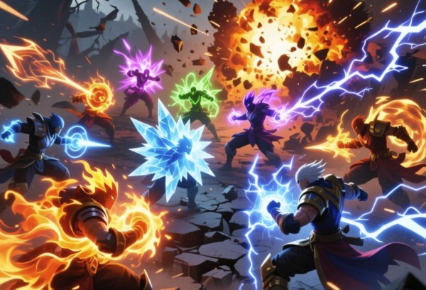
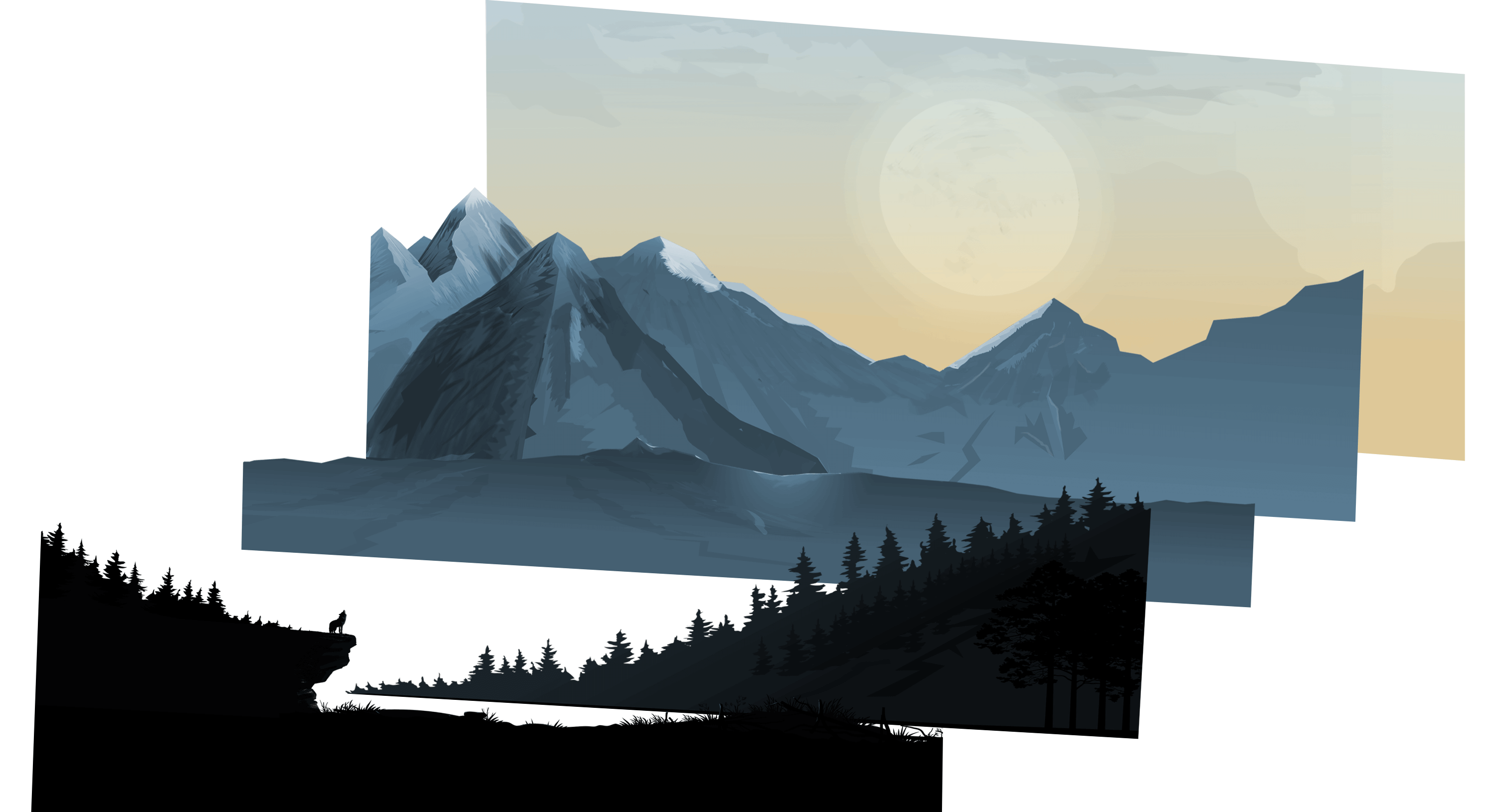
先放一张示意图:
这里实际的距离X和Y在观察者看来是一样的,原因是距离观察者的距离Z不一样导致的。
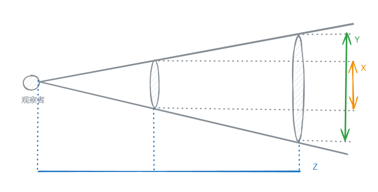
再放一张视差标题背景的3d示意图:
这里为了代码高亮分三部分展示
html部分
<template>
  <section>
    <img :src="p0Src" id="p0" :style="{ transform: `translateY(${p0Top}px)`, zIndex: `100` }" alt="p0">
    <img :src="p1Src" id="p1" :style="{ transform: `translateY(${p1Top}px)`, zIndex: `200` }" alt="p1">
    <img :src="p2Src" id="p2" :style="{ transform: `translateY(${p2Top}px)`, zIndex: `300` }" alt="p2">
    <img :src="p3Src" id="p3" :style="{ transform: `translateY(${p3Top}px)`, zIndex: `400` }" alt="p3">
    <img :src="p4Src" id="p4" :style="{ transform: `translateY(${p4Top}px)`, zIndex: `500` }" alt="p4">
    <img :src="p6Src" id="p6" :style="{ transform: `translateY(${p6Top}px)`, zIndex: `600` }" alt="p6">
    <div id="banner_title"
         class="container"
         :style="{ marginRight: `0px`, marginTop: `${bannerTitleMarginTop}px`, width: `75%`}">
        <h1>{{blogTitle}}</h1>
        <p class="description">{{blogDescription}}</p>
    </div>
  </section>
</template>
js部分
<script>
const imgUrl = "https://xxxxxxxxxxxx/";
export default {
  name: "Banner",
  data() {
    return {
      p0Src: imgUrl + 'banner/ppp0.png',
      p1Src: imgUrl + 'banner/pp1.png',
      p2Src: imgUrl + 'banner/pp2.png',
      p3Src: imgUrl + 'banner/pp3.png',
      p4Src: imgUrl + 'banner/pp4.png',
      p6Src: imgUrl + 'banner/pp6.png',
      p0Top: 0,
      p1Top: 0,
      p2Top: 0,
      p3Top: 0,
      p4Top: 0,
      p6Top: 0,
      bannerTitleMarginTop: -100,
      requestId: undefined, // 用于跟踪 requestAnimationFrame 的标识
    };
  },
  props:{
    blogTitle:{
      type: String,
      require: true
    },
    blogDescription:{
      type: String,
      require: true
    },
  },
  mounted() {
    this.addScrollListener();
  },
  beforeDestroy() {
    this.removeScrollListener();
  },
  methods: {
    addScrollListener() {
      // 使用 passive 参数优化滚动性能
      window.addEventListener('scroll', this.handleScroll, {passive: true});
    },
    removeScrollListener() {
      window.removeEventListener('scroll', this.handleScroll);
    },
    handleScroll() {
      const value = window.scrollY;
      this.p0Top = value * 0.6;
      this.p1Top = value * 0.36;
      this.p2Top = value * 0.24;
      this.p3Top = value * 0.16;
      this.p4Top = value * 0.12;
      this.p6Top = 0;
      this.bannerTitleMarginTop = value * 1.1 - 100;
      // 使用 requestAnimationFrame 更新样式
      if (this.requestId === undefined) {
        this.requestId = requestAnimationFrame(this.updateStyles);
      }
    },
    updateStyles() {
      // 清除请求动画帧标识
      this.requestId = undefined;
    }
  }
}
</script>
style部分
<style scoped>
section {
  position: relative;
  width: 100%;
  height: 100vh;
  padding: 0px;
  display: flex;
  justify-content: center;
  align-items: center;
  overflow: hidden;

  img {
    position: absolute;
    top: 0;
    left: 0;
    width: 100%;
    //height: 100%;
    object-fit: cover;
    pointer-events: none;
    will-change: transform; // 提前告知浏览器哪些属性可能会发生变化
  }

  #p4,#p3,#p2,#p1,#p0 {
    width: 100%;
    height: 100%;
  }

  #p6 {
    width: 100%;
    height: 150%;
  }

  section::before {
    content: '';
    position: absolute;
    bottom: 0;
    width: 100%;
    //height: 100px;
    background: linear-gradient(to top, #1c0522, transparent);
    //z-index: 1000;
  }
}
@-webkit-keyframes bounce {
  0%,10%,25%,40%,50% {
    -webkit-transform: translateY(0) rotate(0deg);
    transform: translateY(0) rotate(0deg)
  }

  20% {
    -webkit-transform: translateY(-10px) rotate(0deg);
    transform: translateY(-10px) rotate(0deg)
  }

  30% {
    -webkit-transform: translateY(-5px) rotate(0deg);
    transform: translateY(-5px) rotate(0deg)
  }
}

@keyframes bounce {
  0%,10%,25%,40%,50% {
    -webkit-transform: translateY(0) rotate(0deg);
    transform: translateY(0) rotate(0deg)
  }

  20% {
    -webkit-transform: translateY(-10px) rotate(0deg);
    transform: translateY(-10px) rotate(0deg)
  }

  30% {
    -webkit-transform: translateY(-5px) rotate(0deg);
    transform: translateY(-5px) rotate(0deg)
  }
}
</style>可以点击七仔的博客然后上下缓慢滚动来查看效果。