开拓者文字游戏网页版
886.33KB · 2025-12-18

文章目录 八、CSS3点击按钮圆形进度打钩效果8.1 图片预览8.2 index.html代码8.3 style.css代码
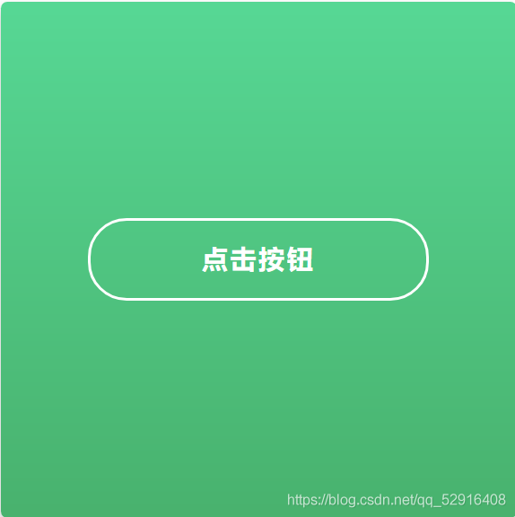

<!DOCTYPE html>
<html lang="en">
	<head>
		<meta charset="UTF-8">
		<title>CSS3点击按钮圆形进度打钩效果</title>
		<!--图标库-->
		<link rel='stylesheet' href='https://cdnjs.clo**udfl*are.com/ajax/libs/font-awesome/5.9.0/css/all.min.css'>
		<!--核心样式-->
		<link rel="stylesheet" href="css/style.css">
	</head>
	<body>
		<div class="background">
			<input type="checkbox" id="button">
			<label for="button" class="button"> 点击按钮<i class="fas fa-check"></i></label>
			<svg class="circle">
				<circle cx="32" cy="32" r="31">
			</svg>
		</div>
	</body>
</html>
body {
	margin: 0;
	height: 100vh;
	width: 100vw;
	display: flex;
	align-items: center;
	justify-content: center;
	font-family: "Lucida Sans Unicode", "Lucida Grande", sans-serif;
	font-size: 14px;
}

.background {
	position: relative;
	background: linear-gradient(to top, #49b26e 0%, #57d895 100%);
	border-radius: 5px;
	display: flex;
	align-items: center;
	justify-content: center;
	flex-direction: column;
	box-shadow: 0 5px 15px 0 rgba(0, 0, 0, 0.25);
	width: 400px;
	height: 400px;
	color: white;
}

.background input {
	display: none;
}

.background .button {
	display: flex;
	justify-content: center;
	align-items: center;
	width: 260px;
	height: 60px;
	border: 2px solid white;
	border-radius: 30px;
	text-align: center;
	font-size: 20px;
	text-transform: uppercase;
	font-weight: bold;
	letter-spacing: 2px;
	transition: all 0.3s ease-in-out;
	cursor: pointer;
}

.background .button:hover {
	background-color: #37be77;
}

.background .button .fas {
	position: absolute;
	color: #4caf50;
	z-index: 2;
	opacity: 0;
}

.background .circle {
	position: absolute;
	width: 65px;
	height: 65px;
	fill: none;
	stroke: white;
	stroke-width: 2px;
	stroke-linecap: round;
	stroke-dasharray: 183 183;
	stroke-dashoffset: 183;
	opacity: 0;
	left: 0;
	bottom: 0;
	right: 0;
	top: 0;
	margin: auto;
	pointer-events: none;
	transform: rotate(-90deg);
}

.background input:checked~.button {
	animation: button 0.5s ease both, fill 0.5s ease-out 1.5s forwards;
}

.background input:checked~.button .fas {
	animation: check 0.5s ease-out 1.5s both;
}

.background input:checked~.circle {
	animation: circle 2s ease-out 0.5s both;
}

@keyframes button {
	0% {
		width: 260px;
		left: 70px;
		border-color: white;
		color: white;
	}

	50% {
		color: transparent;
	}

	100% {
		width: 60px;
		left: 170px;
		border-color: #45b078;
		background: transparent;
		color: transparent;
	}
}

@keyframes circle {
	0% {
		stroke-dashoffset: 183;
	}

	50% {
		stroke-dashoffset: 0;
		stroke-dasharray: 183;
		transform: rotate(-90deg) scale(1);
		opacity: 1;
	}

	90%,
	100% {
		stroke-dasharray: 500 500;
		transform: rotate(-90deg) scale(2);
		opacity: 0;
	}
}

@keyframes fill {
	0% {
		background: transparent;
		border-color: white;
	}

	100% {
		background: white;
	}
}

@keyframes check {
	0% {
		opacity: 0;
	}

	100% {
		opacity: 1;
	}
}
到此这篇关于CSS3点击按钮圆形进度打钩效果的文章就介绍到这了,更多相关css3圆形进度按钮内容请搜索阿里西西以前的文章或继续浏览下面的相关文章,希望大家以后多多支持阿里西西!