
缘之空安卓版汉化
1435MB · 2025-12-24

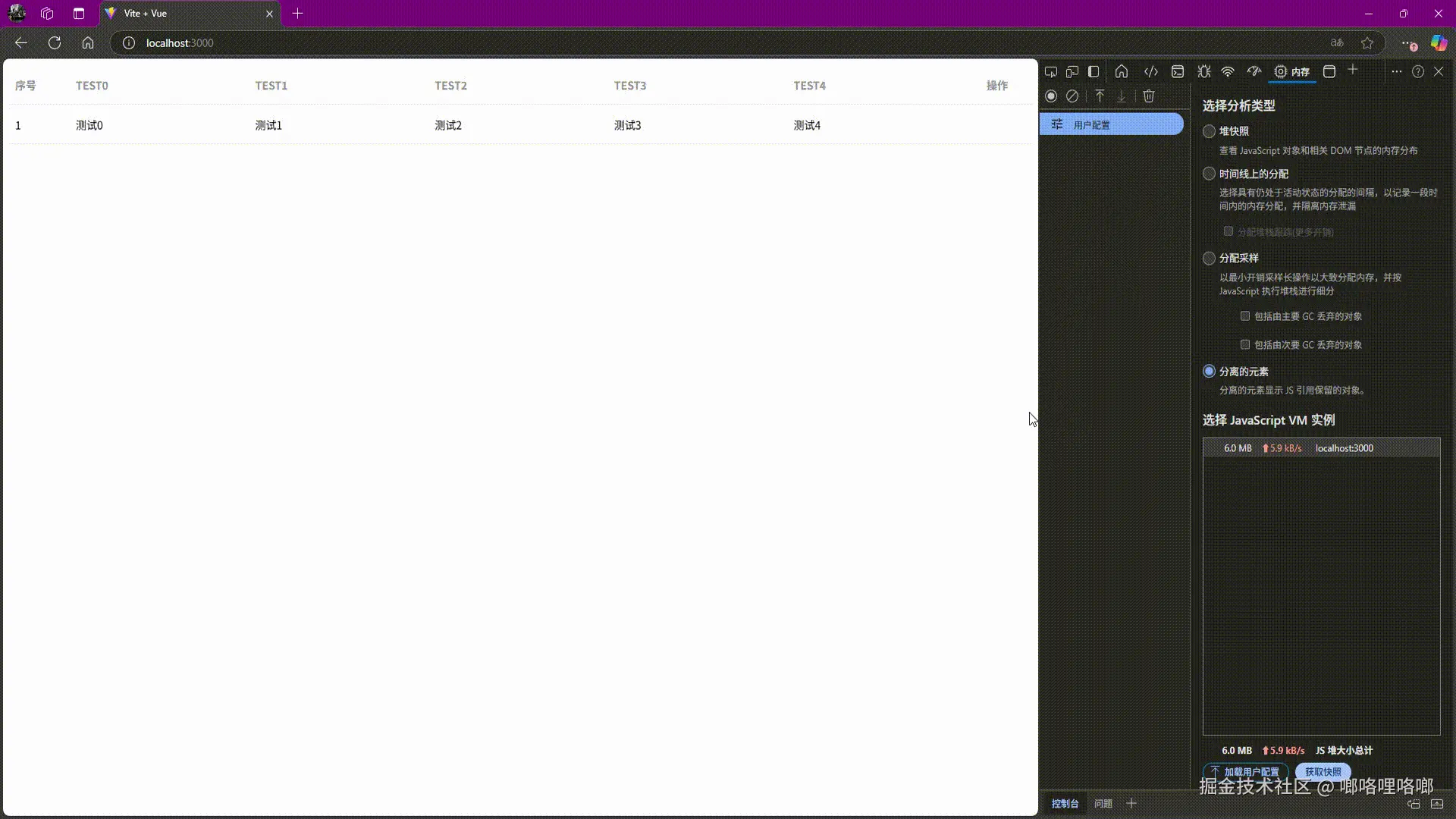
在现代前端项目中,大数据量表格渲染是性能优化的重点场景之一。
Element Plus 的新组件 el-table-v2 基于虚拟滚动,能高效地渲染成千上万行数据。
但在实际开发中,我们常常会遇到一个问题:表格列宽如何随容器大小自适应?
本文将通过一段完整的 Vue 3 代码示例,演示如何让表格在容器大小变化时自动调整列宽。
<template>
  <div style="height: 400px" ref="divRef">
    <el-auto-resizer>
      <template #default="{height, width}">
        <el-table-v2
            :columns="columns"
            :data="tableData"
            :width="width"
            :height="height"
            border
            fixed
        >
          <template #cell="{ rowData, column }">
            <span>{{ rowData[column.key] }}</span>
          </template>
        </el-table-v2>
      </template>
    </el-auto-resizer>
  </div>
</template>
<script setup>
import {onMounted, ref} from "vue";
import {useEventListener} from '@vueuse/core'

const divRef = ref(null)
const columns = ref([
  {
    key: 'index',
    title: '序号',
    width: 80,
    skip: true,
  },
  {
    key: 'TEST0',
    title: 'TEST0'
  },
  {
    key: 'TEST1',
    title: 'TEST1'
  },
  {
    key: 'TEST2',
    title: 'TEST2'
  },
  {
    key: 'TEST3',
    title: 'TEST3'
  },
  {
    key: 'TEST4',
    title: 'TEST4'
  },
  {
    key: 'operation',
    title: '操作',
    width: 80,
    align: 'center',
    skip: true,
  },
])

const tableData = ref([{
  index: 1,
  TEST0: '测试0',
  TEST1: '测试1',
  TEST2: '测试2',
  TEST3: '测试3',
  TEST4: '测试4',
}])


function calculateColumnWidths(tableContainer, columns, width) {
  if (!tableContainer) return

  // 容器可用宽度
  const availableWidth = tableContainer.clientWidth - 6 // 减去滚动条宽度

  // 非固定列平均分配宽度
  const nonFixedColumns = columns.filter(
      (col) => !col.skip
  )
  const nonFixedWidth = (availableWidth - width) / nonFixedColumns.length

  // 更新列宽
  return columns.map((col) => {
    if (col.skip) return col // 固定列保持原宽度
    return {
      ...col,
      width: nonFixedWidth
    }
  })
}

onMounted(() => {
  columns.value = calculateColumnWidths(divRef.value, columns.value, 80 + 80)
  useEventListener('resize', () => {
    columns.value = calculateColumnWidths(divRef.value, columns.value, 80 + 80)
  })
})
</script>