

弹弹岛2vivo客户端
607.37MB · 2025-12-11

大家好,我是花姐。
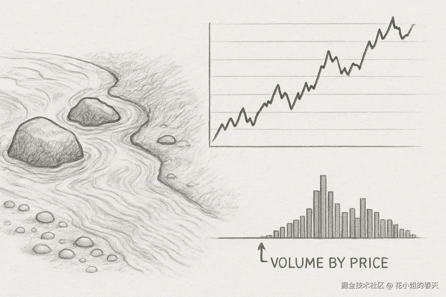
今天我们来聊一个量化交易中非常实用但小白容易忽略的工具——成交量剖面(Volume Profile / Volume by Price)。它能帮我们直观地找到股票的支撑位和压力位,是选股和择时的利器。
本文我会从概念、原理、Python实现到实操策略全方位展开,让你即便是量化小白,也能快速上手。
我这里用的行情数据源是 xtquant + miniQMT。
后续示例里会用到一些常见的 Python 库:pandas, numpy, matplotlib,进阶部分还会涉及 scipy, sklearn。在实际运行代码之前,记得先把环境配置好:
pip install pandas numpy matplotlib scipy scikit-learn xtquant
这样就能避免因为依赖缺失导致的报错啦。
以下是一个基于xtquant + miniQMT获取股票行情的方法,后面的行情Dataframe数据都会通过这个方法来获取:
def get_hq(code,start_date='19900101',period='1d',dividend_type='front_ratio',count=-1):
    '''
    基于xtquant下载某个股票的历史行情
    盘中运行最后一个K里存了最新的行情
    period 1d 1w 1mon
    dividend_type - 除权方式,用于K线数据复权计算,对tick等其他周期数据无效
    none 不复权
    front 前复权
    back 后复权
    front_ratio 等比前复权
    back_ratio 等比后复权
    '''
    xtdata.enable_hello = False
    xtdata.download_history_data(stock_code=code, period='1d',incrementally=True)
    history_data = xtdata.get_market_data_ex(['open','high','low','close','volume','amount','preClose','suspendFlag'],[code],period=period,start_time=start_date,count=count,dividend_type=dividend_type)
    print(history_data)
    df = history_data[code]

    df.index = pd.to_datetime(df.index.astype(str), format='%Y%m%d')
    df['date'] = df.index
    return df
简单说,成交量剖面就是把成交量按价格分布绘制出来,而不是像常规K线图那样按时间分布。 换句话说,它告诉你:某个价格区间里有多少人买进卖出过。
为什么重要?
举个通俗例子:
想象一条小河流,河床上有一些大石头和一些沙子。
在股市里:
换句话说,成交量剖面帮你找到河床的“大石头”,知道价格哪里容易停、哪里容易流动。
POC(Point of Control)
VAH / VAL(Value Area High / Low)
Volume Node(成交量节点)
这些概念可能有点抽象,我们就用“成交量剖面”的计算过程来做一次实操演示,帮助大家更直观地理解整个流程。
每一天我们有如下行情数据:
| 日期 | 开盘价 | 最高价 | 最低价 | 收盘价 | 成交量 |
|---|---|---|---|---|---|
| 2025-09-11 | 10 | 12 | 9 | 11 | 1000 |
假设整个历史区间最低价 8,最高价 14,我们将价格区间分成 6 个区间(简化示例):
价格区间:
[8-9), [9-10), [10-11), [11-12), [12-13), [13-14]
比如2025-09-11这一天,最高价 12,最低价 9,把这个区间切成 4 小段(steps_per_day = 4):
小段价格:
9.0, 9.75, 10.5, 11.25, 12.0
每个小段的成交量 = 当天成交量 ÷ 小段数量 = 1000 ÷ 4 = 250
将每个小段价格对应到上面划分的价格区间:
| 小段价格 | 对应区间 |
|---|---|
| 9.0 | [9-10) |
| 9.75 | [9-10) |
| 10.5 | [10-11) |
| 11.25 | [11-12) |
然后把每个小段的成交量累加到对应区间:
| 区间 | 成交量 |
|---|---|
| [8-9) | 0 |
| [9-10) | 500 |
| [10-11) | 250 |
| [11-12) | 250 |
| [12-13) | 0 |
| [13-14) | 0 |
每天都做同样的操作,把所有小段成交量累加到对应区间,得到最终的成交量剖面:
区间成交量柱状图(横向):
[8-9): 200, [9-10): 1800, [10-11): 2300, [11-12): 1700, [12-13): 900, [13-14): 300
对,你理解得很对。步骤5以后,成交量剖面的计算已经完成,本质上就是把每日的小段成交量累加到每个价格区间,得到一个完整的成交量分布图(横向柱状图)。这个阶段应该是用来得出结论和分析的,而不是再做计算。
高成交量区(HVN, High Volume Node)
[10-11): 2300),说明市场最活跃。低成交量区(LVN, Low Volume Node)
[8-9): 200),说明市场交易稀少。支撑/压力分析
市场心理与策略参考
所以在步骤5完成后,结论就是:
示例代码如下:
from xtquant import xtdata
import pandas as pd
import numpy as np
import matplotlib.pyplot as plt
import mplfinance as mpf
def get_hq(code,start_date='19900101',period='1d',dividend_type='front_ratio',count=-1):
'''
基于xtquant下载某个股票的历史行情
盘中运行最后一个K里存了最新的行情
period 1d 1w 1mon
dividend_type - 除权方式,用于K线数据复权计算,对tick等其他周期数据无效
none 不复权
front 前复权
back 后复权
front_ratio 等比前复权
back_ratio 等比后复权
'''
xtdata.enable_hello = False
xtdata.download_history_data(stock_code=code, period='1d',incrementally=True)
history_data = xtdata.get_market_data_ex(['open','high','low','close','volume','amount','preClose','suspendFlag'],[code],period=period,start_time=start_date,count=count,dividend_type=dividend_type)
df = history_data[code]
df.index = pd.to_datetime(df.index.astype(str), format='%Y%m%d')
df['date'] = df.index
return df
def compute_volume_profile(df, price_bins=50, steps_per_day=10):
"""
计算成交量剖面
参数:
df : DataFrame, 必须包含 ['date', 'open', 'high', 'low', 'close', 'volume']
price_bins : int, 成交量剖面的价格区间数量
steps_per_day : int, 每日高低价划分的小段数量
返回:
volume_profile : np.array, 每个价格区间的成交量
bins : np.array, 价格区间边界
"""
df = df.copy()
# 1. 设置价格区间
price_min = df['low'].min()
price_max = df['high'].max()
bins = np.linspace(price_min, price_max, price_bins)
# 2. 计算每个价格区间的成交量
volume_profile = np.zeros(len(bins)-1)
for i in range(len(df)):
price_range = np.linspace(df['low'].iloc[i], df['high'].iloc[i], steps_per_day)
vol_per_step = df['volume'].iloc[i] / len(price_range)
idx = np.digitize(price_range, bins) - 1
for j in idx:
if 0 <= j < len(volume_profile):
volume_profile[j] += vol_per_step
return volume_profile, bins
def plot_volume_profile(volume_profile, bins):
"""
绘制成交量剖面
"""
plt.rcParams['font.sans-serif'] = ['SimHei']
plt.rcParams['axes.unicode_minus'] = False # 解决负号显示问题
plt.figure(figsize=(16,9))
plt.barh((bins[:-1]+bins[1:])/2, volume_profile, height=(bins[1]-bins[0]), color=plt.cm.viridis(volume_profile/volume_profile.max()))
plt.xlabel('成交量')
plt.ylabel('价格')
plt.title('成交量剖面')
plt.show()
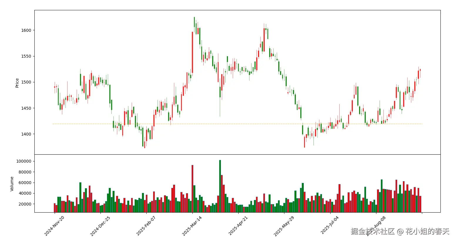
def plot_kline_with_support_resistance(df, volume_profile, bins, top_n=5):
"""
在K线图上标记潜在支撑/压力位
参数:
df : DataFrame, 包含 ['date','open','high','low','close','volume']
volume_profile : np.array, 成交量剖面
bins : np.array, 价格区间
top_n : int, 标记成交量最高的前N个价格区间
"""
# 设置K线样式
mc = mpf.make_marketcolors(up='r', down='g', inherit=True)
s = mpf.make_mpf_style(marketcolors=mc)
# 找成交量top_n价格区
top_idx = np.argsort(volume_profile)[-top_n:]
bottom_idx = np.argsort(volume_profile)[:top_n]
support_resistance_lines = [(bins[idx] + bins[idx+1])/2 for idx in top_idx]
# 添加水平线
hlines = dict(hlines=support_resistance_lines, colors=['orange']*len(support_resistance_lines),
linestyle='--', linewidths=2, alpha=1)
# 绘制K线+成交量+支撑/压力位
mpf.plot(df, type='candle', style=s, volume=True, hlines=hlines)
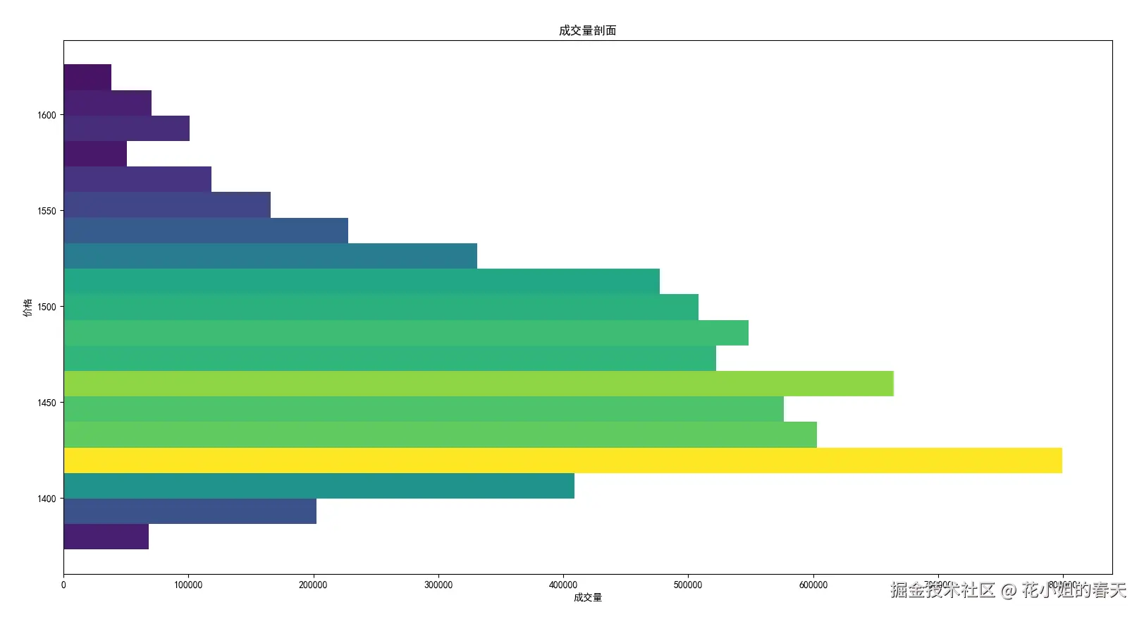
if __name__ == "__main__":
code = '600519.SH' # 贵州茅台
df = get_hq(code, start_date='20200101', period='1d', count=200)
volume_profile, bins = compute_volume_profile(df, price_bins=20, steps_per_day=4)
plot_volume_profile(volume_profile, bins)
plot_kline_with_support_resistance(df, volume_profile, bins, top_n=1)
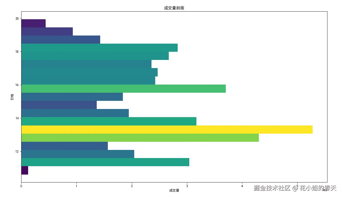
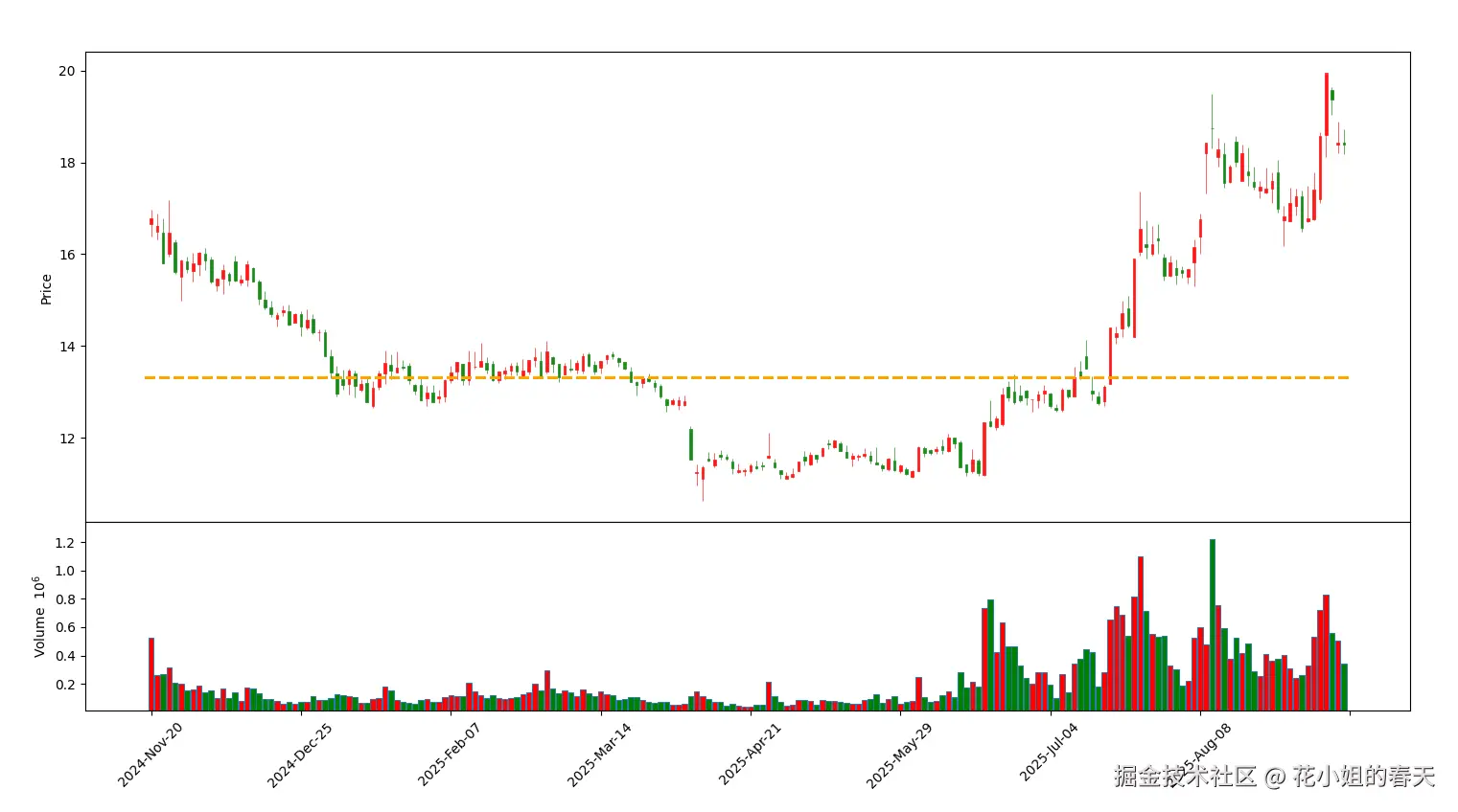
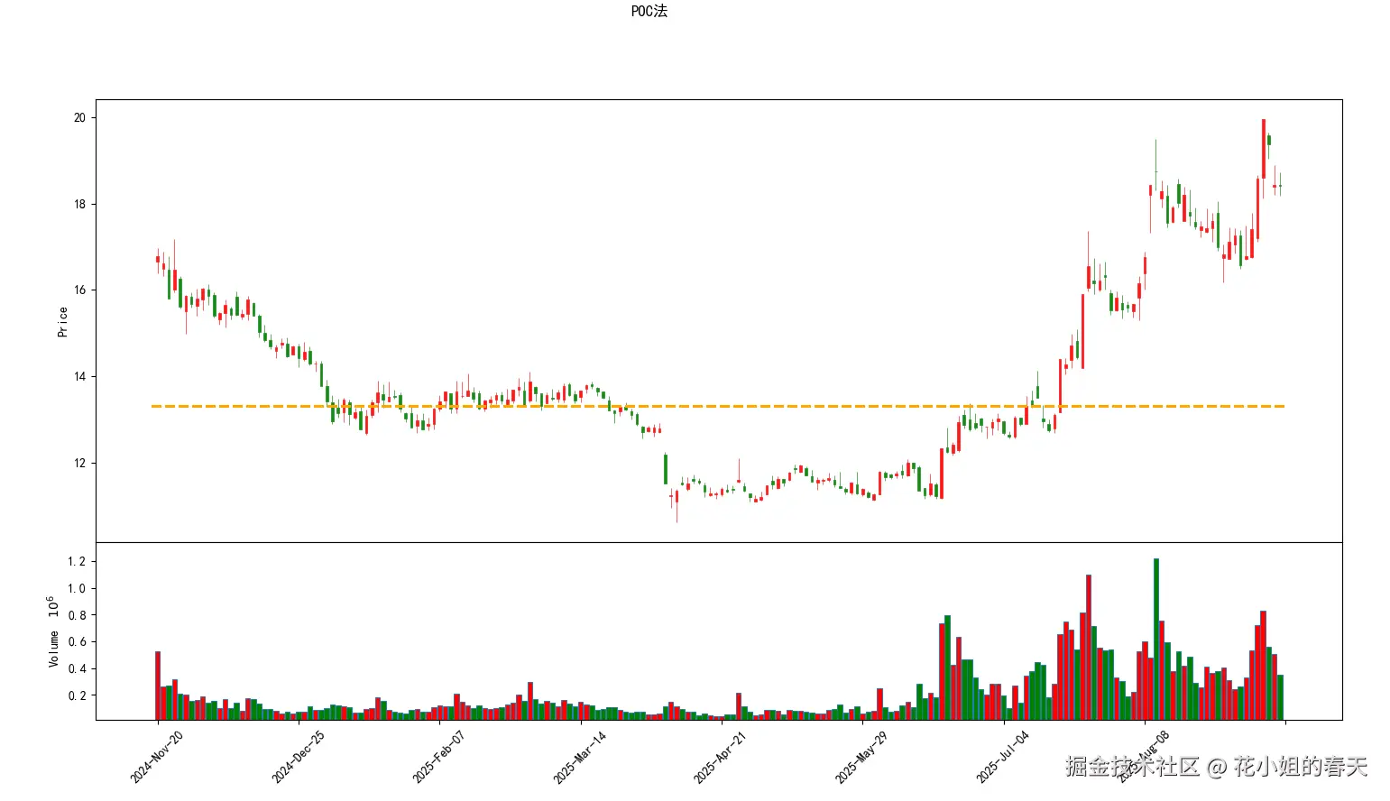
茅台的成交量不是特别集中,看起来不够明显,我换了一个近期放量的股票同样绘制了2个图
poc_index = np.argmax(volume_profile)
poc_price = (bins[poc_index] + bins[poc_index+1]) / 2
print(f"POC支撑/压力位: {poc_price}")
POC就是成交量最多的价格,通常是股价反弹或回落的关键点。
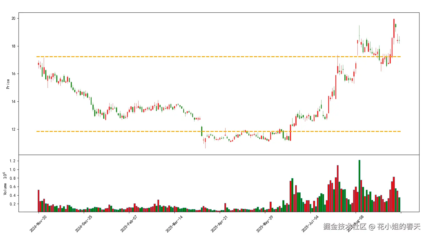
total_vol = volume_profile.sum()
cum_vol = np.cumsum(volume_profile)
val_index = np.where(cum_vol <= 0.15*total_vol)[0][-1]
vah_index = np.where(cum_vol <= 0.85*total_vol)[0][-1]
val_price = (bins[val_index] + bins[val_index+1])/2
vah_price = (bins[vah_index] + bins[vah_index+1])/2
print(f"支撑位 VAL: {val_price}, 压力位 VAH: {vah_price}")
这里我们用15%-85%的累积成交量来定义区间,覆盖约70%的交易量,比较稳妥。
短线反弹策略
突破策略
多时间周期分析
成交量剖面结合均线/指标
成交量剖面是量化交易里非常直观的支撑压力分析工具。 核心思路很简单:
Python实现也不复杂,通过分区累积成交量就能画出图,并快速计算POC、VAH、VAL,辅助策略决策。
今天的文章就到这里了,下一篇我们讲通过VWAP / Anchored VWAP(成交量加权价格) 找到压力与支撑。