
飙车撞僵尸官方版
65.93M · 2025-12-14

旋转照片墙
首先,来看下,是什么效果吧,上效果图 ↓
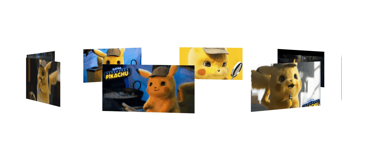
其实这个东西,很容易制作,先说下思路, 把照片都给叠在一起,然后 rotateY 旋转,给每张图片 旋转不一样的角度能构成一圈, 然后translateZ 出去就好了,最后一步,父级转起来。
搭建好基本的 html 和 css ↓ 已经写好注释啦。
<!DOCTYPE html>
<html lang="en">
<head>
    <meta charset="UTF-8">
    <meta name="viewport" content="width=device-width, initial-scale=1.0">
    <meta http-equiv="X-UA-Compatible" content="ie=edge">
    <title>Document</title>
    <style>
        *{
            padding: 0;
            margin: 0;
        }
        :root,body{    /* root在html也就是文档,文档是有高度的,而body 是没有高度的,所以继承下来,给 body的子元素使用*/
            height: 100%;
        }
        .wra{
            position: absolute;    /* 把父级作为容器,定位到屏幕的中间去 */
            width: 200px;
            height: 100px;
            left: calc(50% - 100px);
            top: calc(50% - 50px);
        }
        .img{
            position: absolute;   /*设置定位属性,然后所与的图片就会 叠在一起。*/
            width: 200px;
            height: 100px;
        }
        .img:nth-of-type(1){
            background-image: url('./img/rotatePic/u=1036157886,1414018506&fm=26&gp=0.jpg');
            background-size: cover; /*这个参数,是为了更好的显示完整的图片,既是他有可能显示不全。*/
        }
        .img:nth-of-type(2){
            background-image: url('./img/rotatePic/u=1252635897,4048351284&fm=26&gp=0.jpg');
            background-size: cover;
        }
        .img:nth-of-type(3){
            background-image: url('./img/rotatePic/u=1369094069,1969348532&fm=26&gp=0.jpg');
            background-size: cover;
        }
        .img:nth-of-type(4){
            background-image: url('./img/rotatePic/u=1891680577,1135327170&fm=26&gp=0.jpg');
            background-size: cover;
        }
        .img:nth-of-type(5){
            background-image: url('./img/rotatePic/u=215760299,4224999617&fm=26&gp=0.jpg');
            background-size: cover;
        }
        .img:nth-of-type(6){
            background-image: url('./img/rotatePic/u=4188003421,389717180&fm=26&gp=0.jpg');
            background-size: cover;
        }
        .img:nth-of-type(7){
            background-image: url('./img/rotatePic/下载 (1).jfif');
            background-size: cover;
        }
        .img:nth-of-type(8){
            background-image: url('./img/rotatePic/下载 (2).jfif');
            background-size: cover;
        }
    </style>
</head>
<body>
    <div class="wra">
        <div class="img"></div>
        <div class="img"></div>
        <div class="img"></div>
        <div class="img"></div>
        <div class="img"></div>
        <div class="img"></div>
        <div class="img"></div>
        <div class="img"></div>
    </div>
</body>
</html>
效果如下:
基本架子搭建好后,给每张图片,旋转不同的位置。
<!DOCTYPE html>
<html lang="en">
<head>
    <meta charset="UTF-8">
    <meta name="viewport" content="width=device-width, initial-scale=1.0">
    <meta http-equiv="X-UA-Compatible" content="ie=edge">
    <title>Document</title>
    <style>
        *{
            padding: 0;
            margin: 0;
        }
        :root,body{
            height: 100%;
        }
        .wra{
            position: absolute;
            width: 200px;
            height: 100px;
            left: calc(50% - 100px);
            top: calc(50% - 50px);
        }
        .img{
            position: absolute;
            width: 200px;
            height: 100px;
        }
        .img:nth-of-type(1){
            background-image: url('./img/rotatePic/u=1036157886,1414018506&fm=26&gp=0.jpg');
            background-size: cover;
            /*第一张图片,就不用旋转了,让他在原位置就好。*/
        }
        .img:nth-of-type(2){
            background-image: url('./img/rotatePic/u=1252635897,4048351284&fm=26&gp=0.jpg');
            background-size: cover;
            transform: rotateY(45deg);
        }
        .img:nth-of-type(3){
            background-image: url('./img/rotatePic/u=1369094069,1969348532&fm=26&gp=0.jpg');
            background-size: cover;
            transform: rotateY(90deg);
        }
        .img:nth-of-type(4){
            background-image: url('./img/rotatePic/u=1891680577,1135327170&fm=26&gp=0.jpg');
            background-size: cover;
            transform: rotateY(135deg);
        }
        .img:nth-of-type(5){
            background-image: url('./img/rotatePic/u=215760299,4224999617&fm=26&gp=0.jpg');
            background-size: cover;
            transform: rotateY(180deg);
        }
        .img:nth-of-type(6){
            background-image: url('./img/rotatePic/u=4188003421,389717180&fm=26&gp=0.jpg');
            background-size: cover;
            transform: rotateY(225deg);
        }
        .img:nth-of-type(7){
            background-image: url('./img/rotatePic/下载 (1).jfif');
            background-size: cover;
            transform: rotateY(270deg);
        }
        .img:nth-of-type(8){
            background-image: url('./img/rotatePic/下载 (2).jfif');
            background-size: cover;
            transform: rotateY(315deg);
        }
    </style>
</head>
<body>
    <div class="wra">
        <div class="img"></div>
        <div class="img"></div>
        <div class="img"></div>
        <div class="img"></div>
        <div class="img"></div>
        <div class="img"></div>
        <div class="img"></div>
        <div class="img"></div>
    </div>
</body>
</html>
旋转好位置后,添加 translateZ() 参数,分开图片。因为,translateZ 也是 transform 的参数之一,所以要添加在rotate后面接上。最后,记得在15行添加上 perspective 属性。不懂什么是 perspective 属性的话,请点击→ css3系列之详解perspective
 <!DOCTYPE html>
 <html lang="en">
 <head>
     <meta charset="UTF-8">
     <meta name="viewport" content="width=device-width, initial-scale=1.0">
     <meta http-equiv="X-UA-Compatible" content="ie=edge">
     <title>Document</title>
     <style>
         *{
            padding: 0;
            margin: 0;
        }
        :root,body{
            height: 100%;
            perspective: 1000px;
        }
        .wra{
            position: absolute;
            width: 200px;
            height: 100px;
            left: calc(50% - 100px);
            top: calc(50% - 50px);
            transform-style: preserve-3d; /*这个属性的作用呢,是为了让浏览器,以3d的方式来渲染,
                                            这个属性要添在父级身上,那么他的子元素,就能以3d的方式展示。
                                            浏览器默认的渲染方式是2d的,我们这种3d结构,他显示不出来。 */
        }
        .img{
            position: absolute;
            width: 200px;
            height: 100px;
        }
        .img:nth-of-type(1){
            background-image: url('./img/rotatePic/u=1036157886,1414018506&fm=26&gp=0.jpg');
            background-size: cover;
            transform: translateZ(350px);
        }
        .img:nth-of-type(2){
            background-image: url('./img/rotatePic/u=1252635897,4048351284&fm=26&gp=0.jpg');
            background-size: cover;
            transform: rotateY(45deg) translateZ(350px);
        }
        .img:nth-of-type(3){
            background-image: url('./img/rotatePic/u=1369094069,1969348532&fm=26&gp=0.jpg');
            background-size: cover;
            transform: rotateY(90deg) translateZ(350px);
        }
        .img:nth-of-type(4){
            background-image: url('./img/rotatePic/u=1891680577,1135327170&fm=26&gp=0.jpg');
            background-size: cover;
            transform: rotateY(135deg) translateZ(350px);
        }
        .img:nth-of-type(5){
            background-image: url('./img/rotatePic/u=215760299,4224999617&fm=26&gp=0.jpg');
            background-size: cover;
            transform: rotateY(180deg) translateZ(350px);
        }
        .img:nth-of-type(6){
            background-image: url('./img/rotatePic/u=4188003421,389717180&fm=26&gp=0.jpg');
            background-size: cover;
            transform: rotateY(225deg) translateZ(350px);
        }
        .img:nth-of-type(7){
            background-image: url('./img/rotatePic/下载 (1).jfif');
            background-size: cover;
            transform: rotateY(270deg) translateZ(350px);
        }
        .img:nth-of-type(8){
            background-image: url('./img/rotatePic/下载 (2).jfif');
            background-size: cover;
            transform: rotateY(315deg) translateZ(350px);
        }
    </style>
</head>
<body>
    <div class="wra">
        <div class="img"></div>
        <div class="img"></div>
        <div class="img"></div>
        <div class="img"></div>
        <div class="img"></div>
        <div class="img"></div>
        <div class="img"></div>
        <div class="img"></div>
    </div>
</body>
</html>
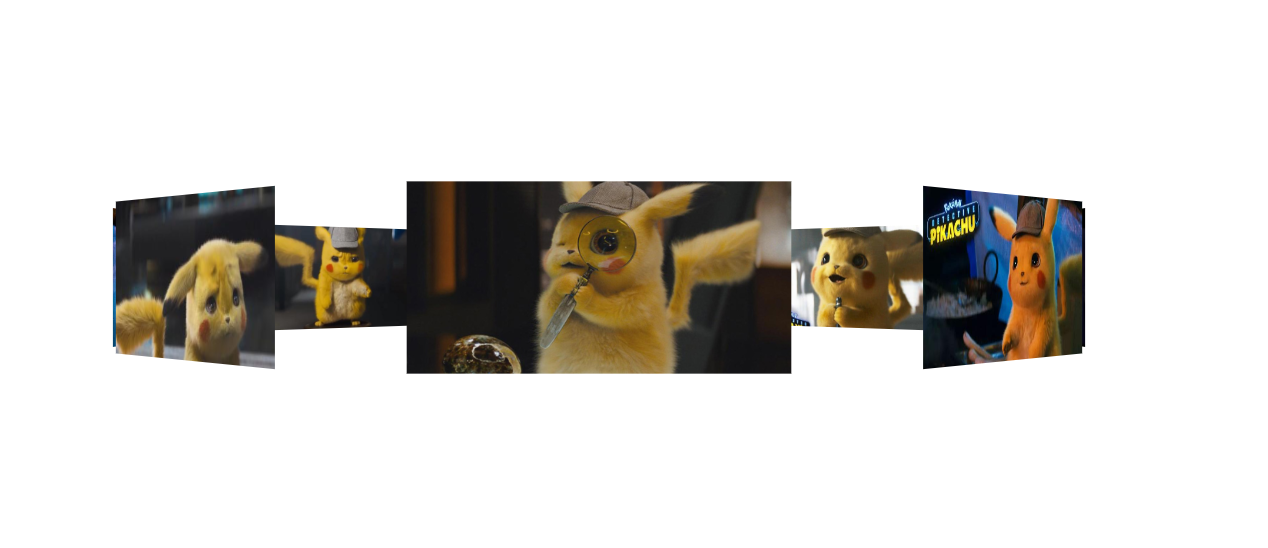
然后你就能看见这种效果啦。
然后,我们给父级 加上旋转的功能就OK了。
<!DOCTYPE html>
<html lang="en">
<head>
    <meta charset="UTF-8">
    <meta name="viewport" content="width=device-width, initial-scale=1.0">
    <meta http-equiv="X-UA-Compatible" content="ie=edge">
    <title>Document</title>
    <style>
        *{
            padding: 0;
            margin: 0;
        }
        :root,body{
            height: 100%;
            perspective: 1000px;
        }
        @keyframes run{   /*这里我们要他旋转360度,那么就不用那么麻烦写关键帧了。开始0  结束360,然后循环即可*/
            0%{
                transform: rotateY(0deg);
            }
            100%{
                transform: rotateY(360deg);
            }
        }
        .wra{
            position: absolute;
            width: 200px;
            height: 100px;
            left: calc(50% - 100px);
            top: calc(50% - 50px);
            transform-style: preserve-3d;
            animation: run 20s linear infinite; /*animation linear是匀速运动,infinite是无限循环*/
        }
        .img{
            position: absolute;
            width: 200px;
            height: 100px;
        }
        .img:nth-of-type(1){
            background-image: url('./img/rotatePic/u=1036157886,1414018506&fm=26&gp=0.jpg');
            background-size: cover;
            transform: translateZ(350px);
        }
        .img:nth-of-type(2){
            background-image: url('./img/rotatePic/u=1252635897,4048351284&fm=26&gp=0.jpg');
            background-size: cover;
            transform: rotateY(45deg) translateZ(350px);
        }
        .img:nth-of-type(3){
            background-image: url('./img/rotatePic/u=1369094069,1969348532&fm=26&gp=0.jpg');
            background-size: cover;
            transform: rotateY(90deg) translateZ(350px);
        }
        .img:nth-of-type(4){
            background-image: url('./img/rotatePic/u=1891680577,1135327170&fm=26&gp=0.jpg');
            background-size: cover;
            transform: rotateY(135deg) translateZ(350px);
        }
        .img:nth-of-type(5){
            background-image: url('./img/rotatePic/u=215760299,4224999617&fm=26&gp=0.jpg');
            background-size: cover;
            transform: rotateY(180deg) translateZ(350px);
        }
        .img:nth-of-type(6){
            background-image: url('./img/rotatePic/u=4188003421,389717180&fm=26&gp=0.jpg');
            background-size: cover;
            transform: rotateY(225deg) translateZ(350px);
        }
        .img:nth-of-type(7){
            background-image: url('./img/rotatePic/下载 (1).jfif');
            background-size: cover;
            transform: rotateY(270deg) translateZ(350px);
        }
        .img:nth-of-type(8){
            background-image: url('./img/rotatePic/下载 (2).jfif');
            background-size: cover;
            transform: rotateY(315deg) translateZ(350px);
        }
    </style>
</head>
<body>
    <div class="wra">
        <div class="img"></div>
        <div class="img"></div>
        <div class="img"></div>
        <div class="img"></div>
        <div class="img"></div>
        <div class="img"></div>
        <div class="img"></div>
        <div class="img"></div>
    </div>
</body>
</html>
最后,再加上一个小功能。像你想看哪里,鼠标就移动到 那里 即可,代码在93行开始。
 <!DOCTYPE html>
 <html lang="en">
 <head>
     <meta charset="UTF-8">
     <meta name="viewport" content="width=device-width, initial-scale=1.0">
     <meta http-equiv="X-UA-Compatible" content="ie=edge">
     <title>Document</title>
     <style>
         *{
            padding: 0;
            margin: 0;
        }
        :root,body{
            height: 100%;
            perspective: 1000px;
        }
        @keyframes run{
            0%{
                transform: rotateY(0deg);
            }
            100%{
                transform: rotateY(360deg);
            }
        }
        .wra{
            position: absolute;
            width: 200px;
            height: 100px;
            left: calc(50% - 100px);
            top: calc(50% - 50px);
            transform-style: preserve-3d;
            animation: run 20s linear infinite;
        }
        .img{
            position: absolute;
            width: 200px;
            height: 100px;
        }
        .img:nth-of-type(1){
            background-image: url('./img/rotatePic/u=1036157886,1414018506&fm=26&gp=0.jpg');
            background-size: cover;
            transform: translateZ(350px);
        }
        .img:nth-of-type(2){
            background-image: url('./img/rotatePic/u=1252635897,4048351284&fm=26&gp=0.jpg');
            background-size: cover;
            transform: rotateY(45deg) translateZ(350px);
        }
        .img:nth-of-type(3){
            background-image: url('./img/rotatePic/u=1369094069,1969348532&fm=26&gp=0.jpg');
            background-size: cover;
            transform: rotateY(90deg) translateZ(350px);
        }
        .img:nth-of-type(4){
            background-image: url('./img/rotatePic/u=1891680577,1135327170&fm=26&gp=0.jpg');
            background-size: cover;
            transform: rotateY(135deg) translateZ(350px);
        }
        .img:nth-of-type(5){
            background-image: url('./img/rotatePic/u=215760299,4224999617&fm=26&gp=0.jpg');
            background-size: cover;
            transform: rotateY(180deg) translateZ(350px);
        }
        .img:nth-of-type(6){
            background-image: url('./img/rotatePic/u=4188003421,389717180&fm=26&gp=0.jpg');
            background-size: cover;
            transform: rotateY(225deg) translateZ(350px);
        }
        .img:nth-of-type(7){
            background-image: url('./img/rotatePic/下载 (1).jfif');
            background-size: cover;
            transform: rotateY(270deg) translateZ(350px);
        }
        .img:nth-of-type(8){
            background-image: url('./img/rotatePic/下载 (2).jfif');
            background-size: cover;
            transform: rotateY(315deg) translateZ(350px);
        }
    </style>
</head>
<body>
    <div class="wra">
        <div class="img"></div>
        <div class="img"></div>
        <div class="img"></div>
        <div class="img"></div>
        <div class="img"></div>
        <div class="img"></div>
        <div class="img"></div>
        <div class="img"></div>
    </div>
    <script>
        document.body.onmousemove = function(e){
            this.style.perspectiveOrigin = e.pageX + 'px ' + e.pageY +'px';
        }
    </script>
</body>
</html>
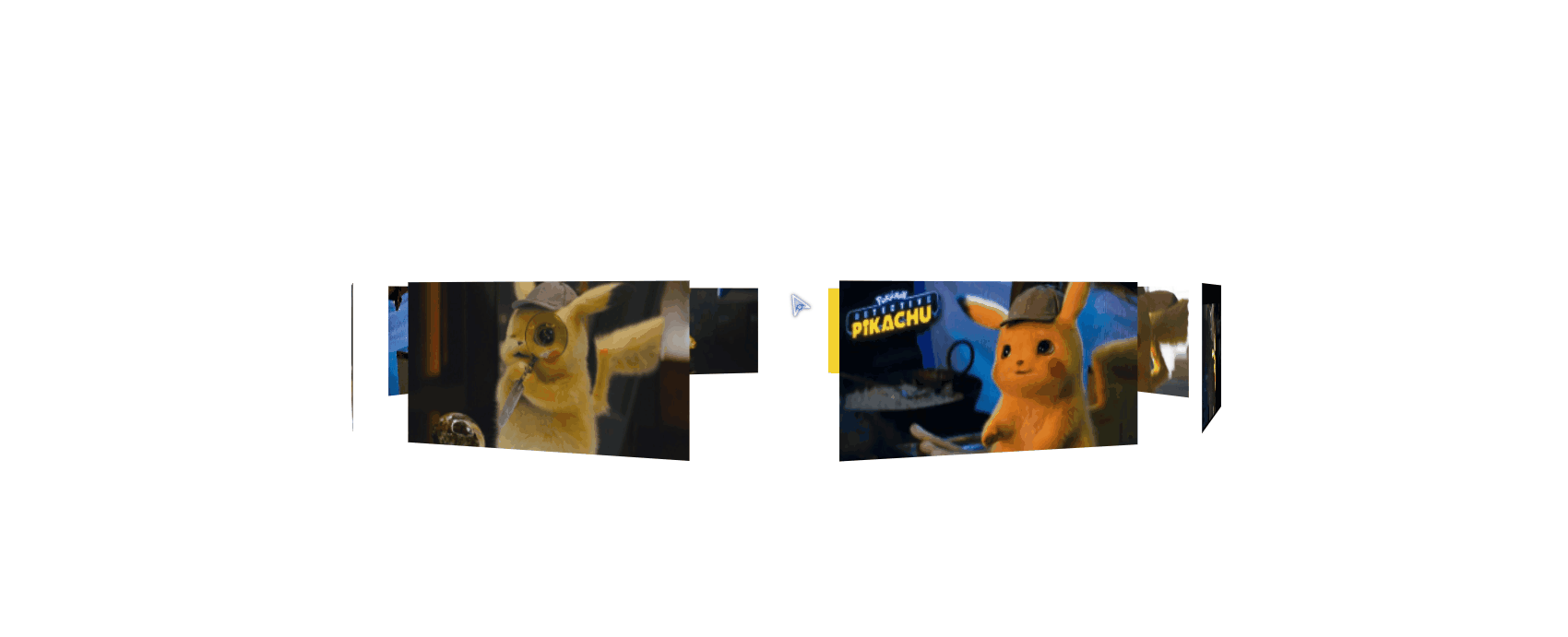
看一下效果好吧。